Getaway web Experiences.
Getaway
Getaway is striving to making space for more free time by providing restorative stays in nature.
As the Senior Brand Designer, I worked closely with the VP of Creative, Brand Design Lead, and Product Designer on a range of web-driven digital design projects.
In 2023, with the lead product designer, I provided art direction and iconography for a redesign of our city pages (pages which segmented audiences are driven to based on location). As our product lead designed the pages, I worked alongside him to provide strategic creative insight, review user testing, and share design feedback on typography hierarchy, layout, and new features. To also better highlight the cabin amenities and local attractions, I designed a new suite of iconography.
In 2021, I led the UI design from wire-framing to launch of Getaway’s editorial blog, The Journal.
Iconography
Collaborator: Jonathan Gonzales (Product Designer)
Amenities
Previously, amenities were featured in a written itemized list — and frequently overlooked by guests who would later inquire about what was included in their upcoming stay. The goal: create a more visual-forward guide for users to easily scan and confirm amenities. To this end, I sought to avoid generic hospitality iconography by designing a custom suite of iconography, tailored to the details of Getaway’s products and featured amenities. From Getaway’s signature big window bed and cellphone lockbox, down to the Adirondack chair set and soap bottles, we transformed a utilitarian need into an ownable brand moment on a high-traffic page.
Local Attractions
In planning their upcoming stay, guests also frequently seek to discover what surrounds the Getaway outpost (location) — including nearby nature trails, restaurants, and businesses. We direct guests to guides on our blog, The Journal, as well as printed guides in-cabin upon arrival, but we began to see a correlation between this information and booking conversion rate.
To highlight local attractions as a reason for booking, we strategically collaborated with the guest experience team to synthesize the top categories of requested local attractions and create custom iconography to showcase the top 3 on each outpost’s page.
Journal Redesign
Collaborators: Jonathan Gonzales (Product Designer), Development (Matt Jacob), Content (Hannah McSorley), Art Direction (Laura Jensen), Creative Direction (Lance Gorton)
Providing local guides, guest stories, campfire cooking recipes, and packing tips, The Journal houses all things editorial surrounding Getaway. Guests are driven to the blog from social, email and the website, and it continues to serve as a one of the highest converting touch-points of the company’s digital footprint.
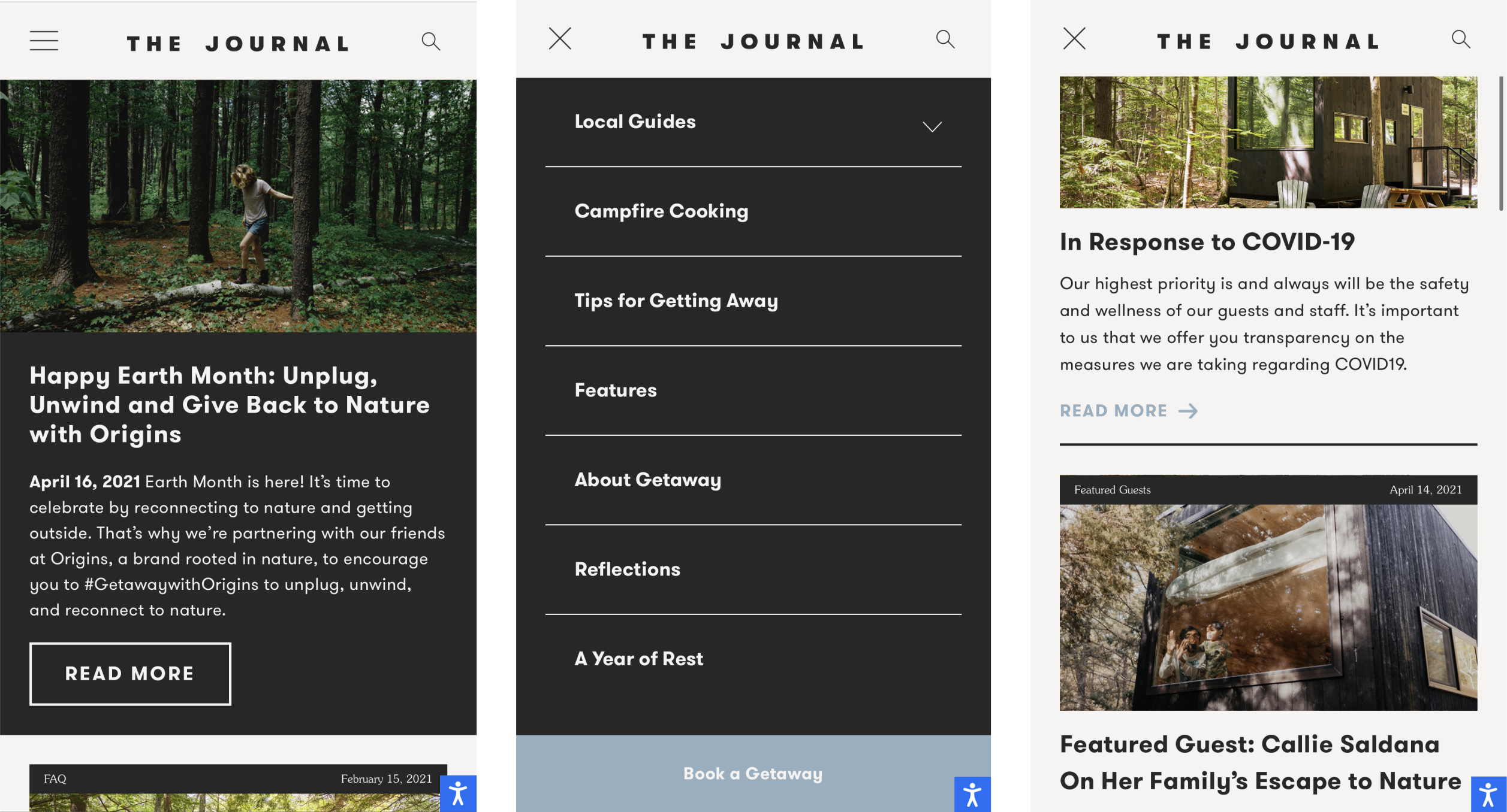
However, the existing Journal was a visually-dated and modular, out-of-the-box site that needed a stronger visual POV that connected to Getaway’s larger brand identity. In 2021, redesigning the site became a year-long creative and cross-departmental priority with myself as the lead designer.
In collaboration with marketing, development and key leadership team members, I sought to strategically develop a refreshed site design as an ownable microbrand that showcases Getaway’s brand story, informed by key user behavior and optimization.


Previous Design

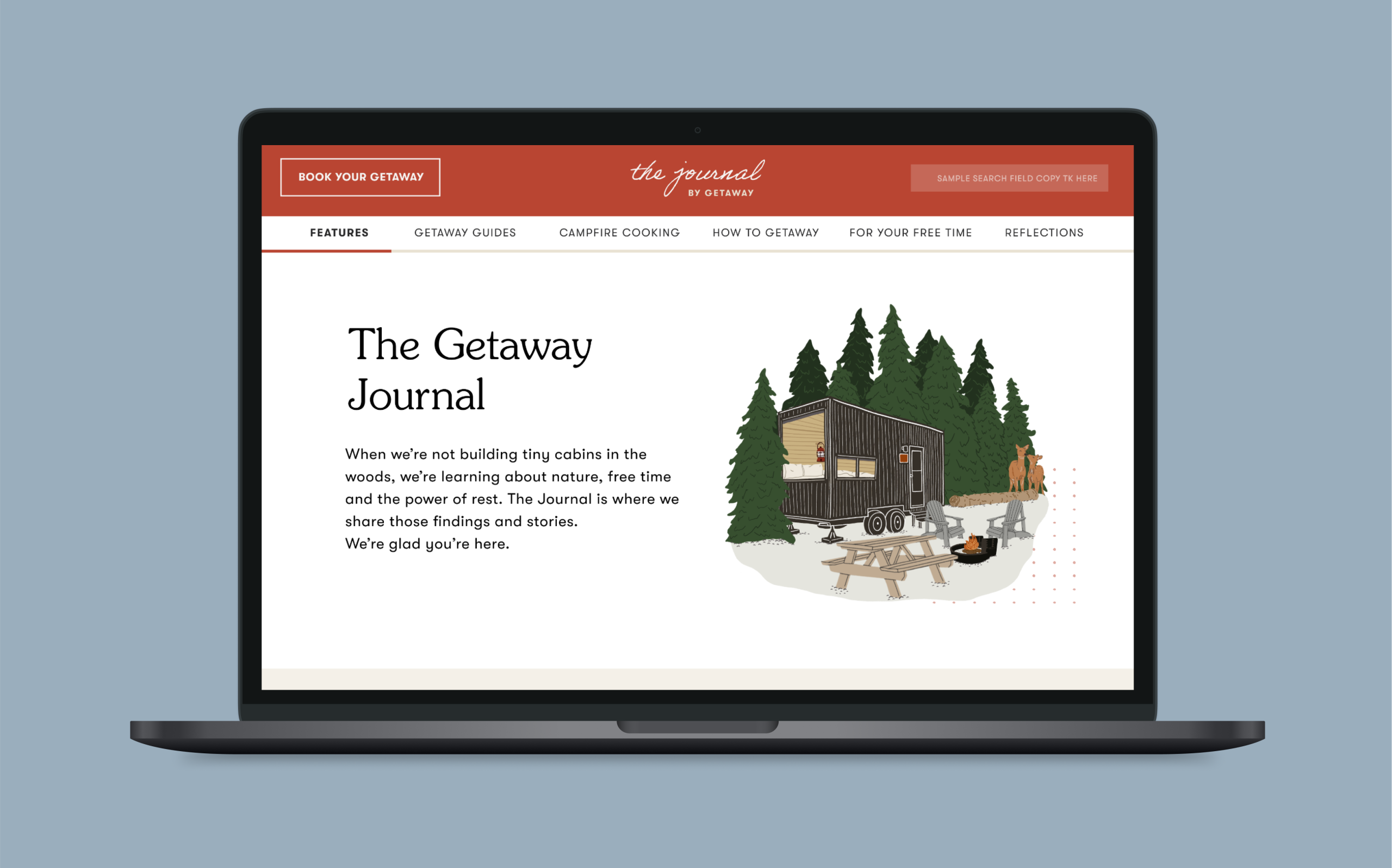
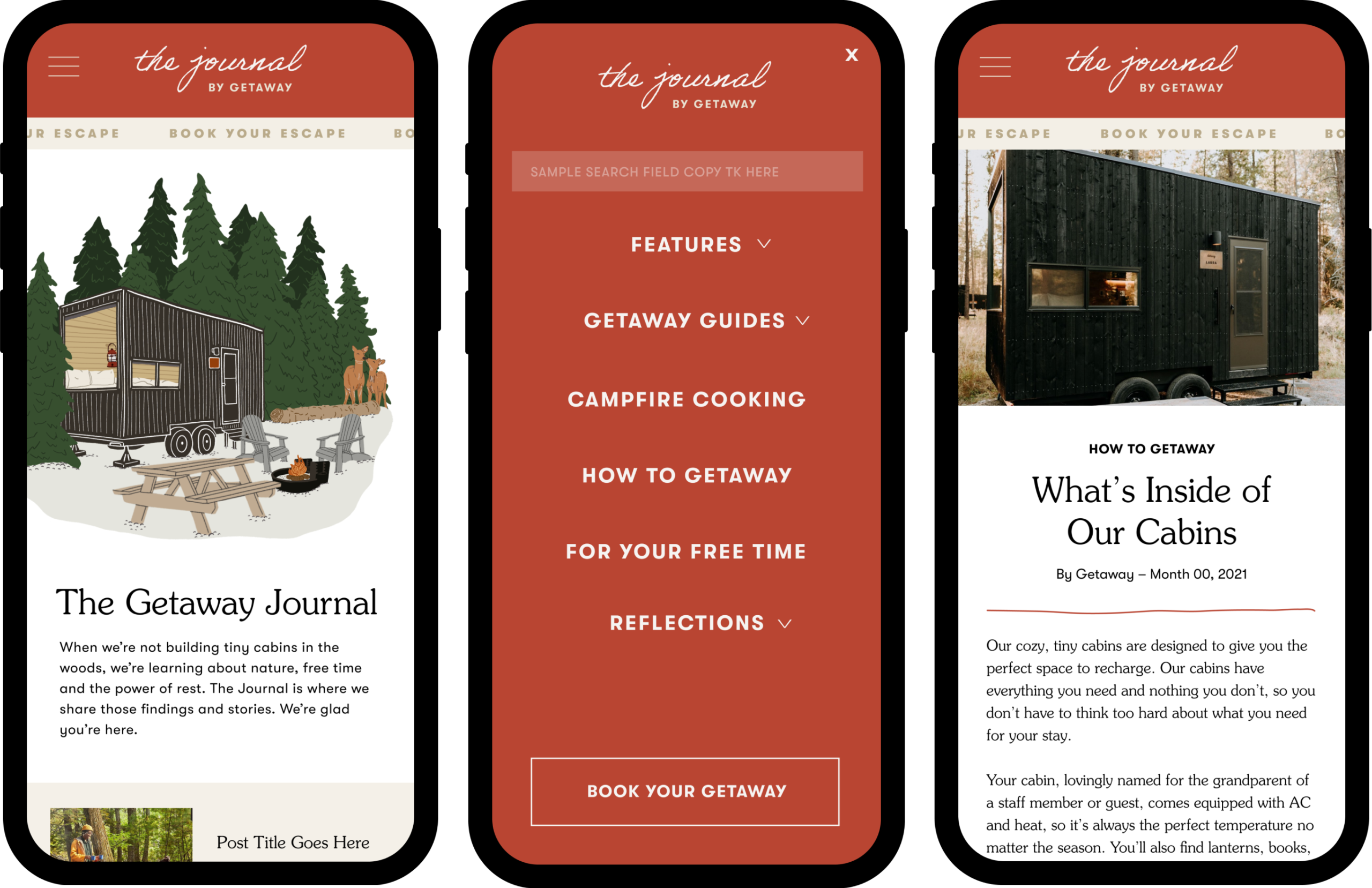
Redesign
Design Elements
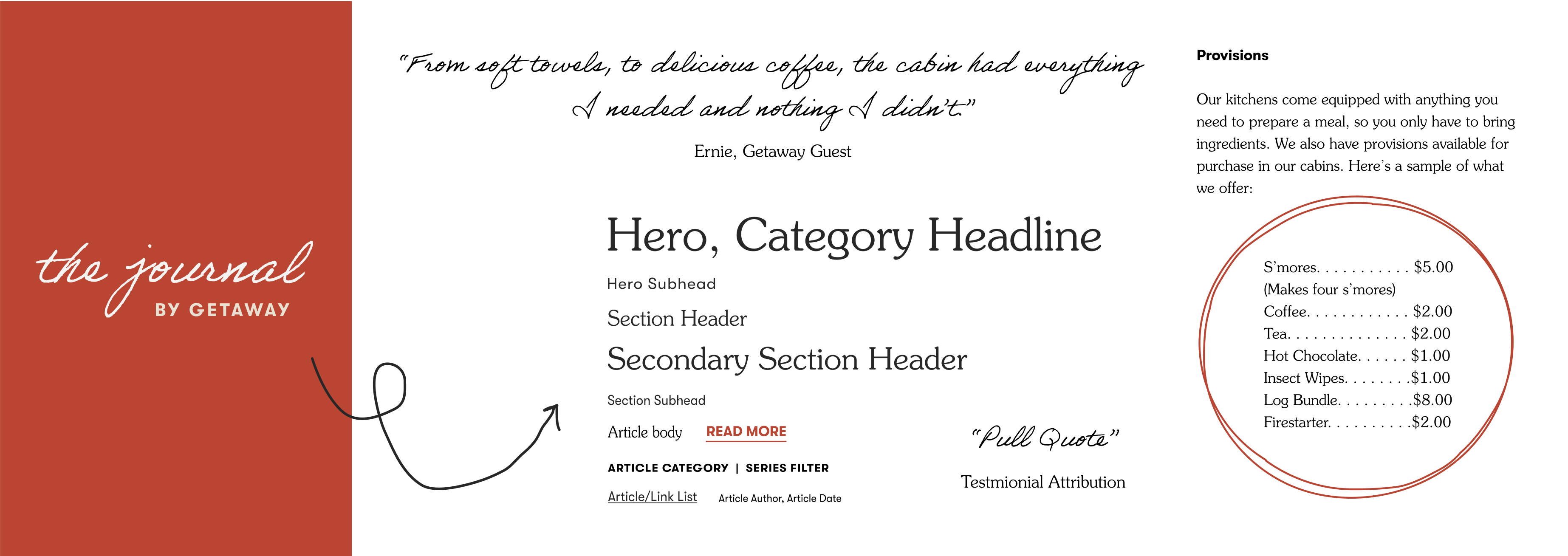
The newly developed microbrand was brought to life through a design system of logo title treatments, typography and mixed medium visuals.
Logo
Embodying the personal touch of The Journal, and the stories of our cabins and guests, our new logo was typeset in the handwritten Adobe Handwriting Ernie typeface and complimented with a subhead to complete the lock-up.
Typeface
Notably, for body copy, we utilized our brand serif typeface, ITC Souvenir, in alignment with a more tactile, editorial experience of reading a newspaper or book. Below is a sampling of the full type system.
Mixed Medium Visuals
In order to create a more expansive vehicle for the range of content, we shifted to a visual style that is mixed medium. This includes a blend of photography (Current, as well as older, archival photos), illustration (both line and full color), and digital collage.
Lastly, but perhaps my favorite detail, we tied the handwritten nature of the logo treatment throughout individual pages and blog posts with annotated illustrated elements that harken to the look and feel of ones own journal.

getaway.house | IG: @GetawayHouse
