Brand identity.
Suitcraft
Suitcraft is an early stage custom tailoring company at the crossroads of classic and quirk. The founders brought me on to build their brand identity from the ground up.
From a strategy and discovery all the way through brand guidelines for handoff, our goal was to establish the foundation of their brand’s visual architecture, as well as landing a clarified purpose and messaging.
Scope
- Discovery + Strategy
- Naming + Messaging
- Logo, Type + Color
- Icon Design
- Messaging
- Print Collateral Design
- Brand Guidelines
Logo Design
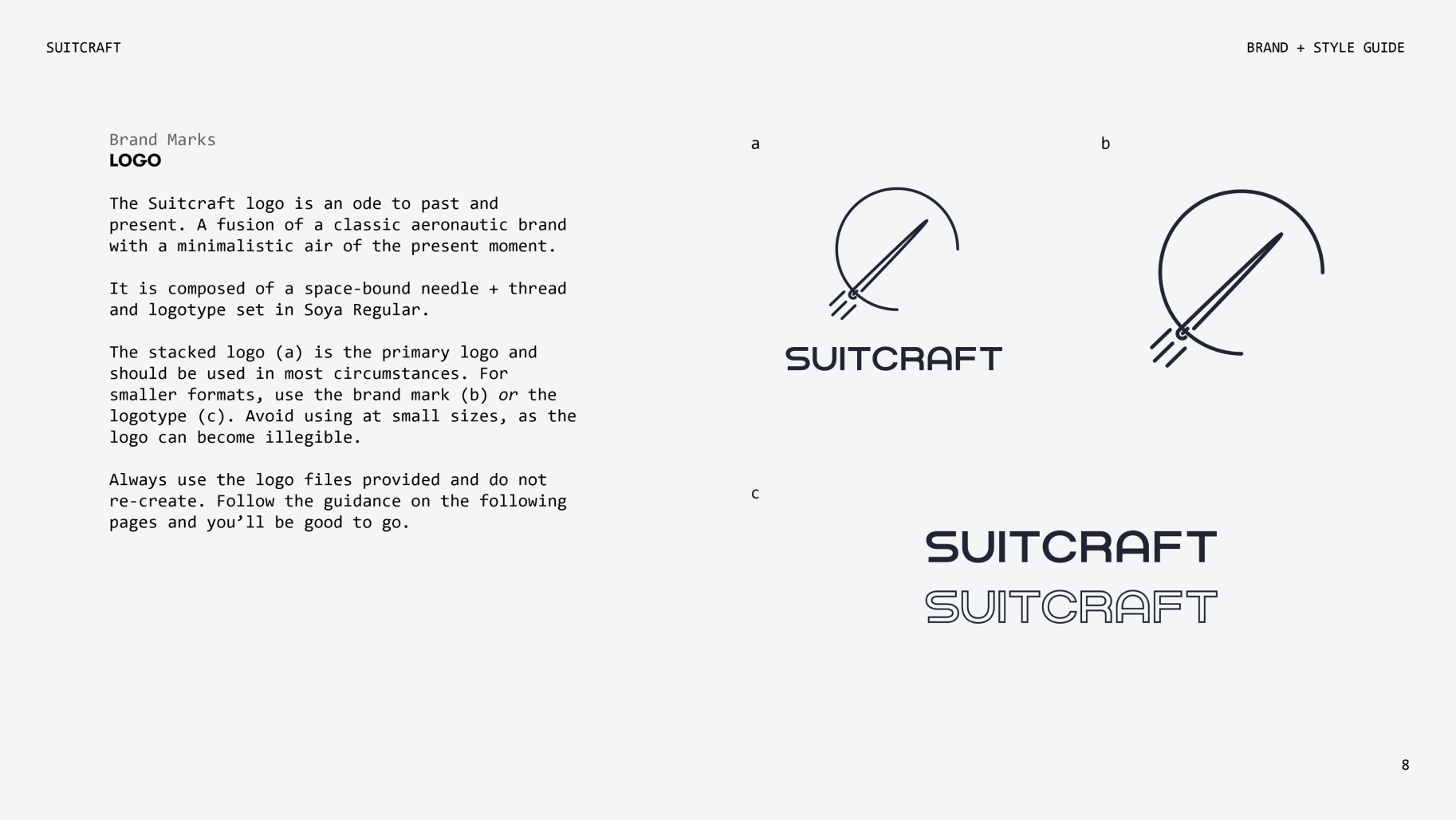
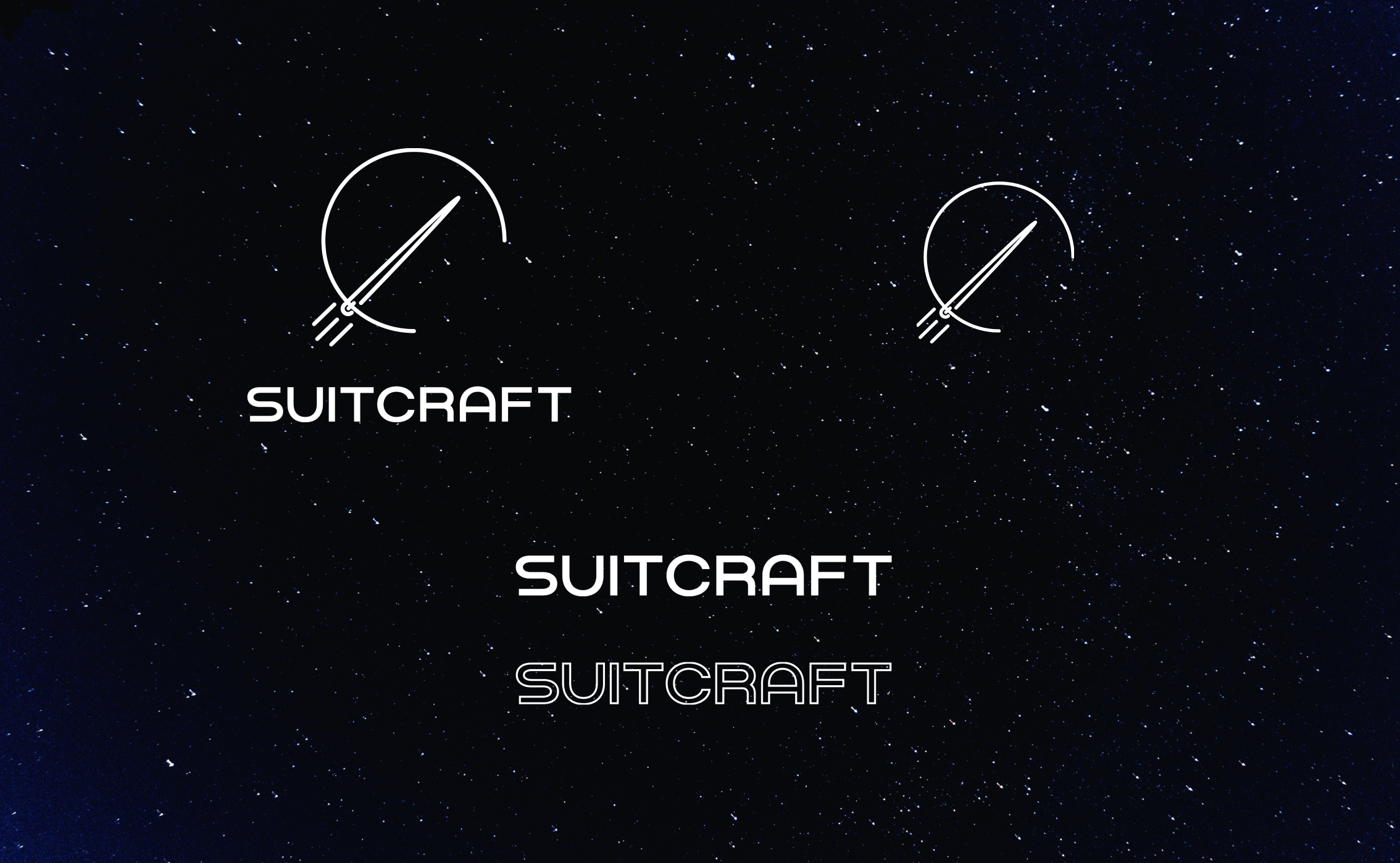
The goal was to create a versatile logo system that felt innovative and fresh, yet not driven by time-bound design trends. We needed to not only keep in mind addressing a range of use cases (Apparel labels, packaging collateral, print marketing, digital channels), but also striking the balance of communicating the brand’s value proposition (made-to-measure classics) with its differentiation (intergalactic quirk and customization).
We explored a number of typefaces, wordmarks and visualizations, landing on a bold typeface that lives with and without the brand’s custom iconographic mark — a needle, propelling itself into space, with its thread creating the enclosure and circular form.
Brand Architecture
Through the strategic discovery and exploration phases, the foundational pillars of the brand were established before the design language was crafted. This included pillars of vision and mission, brand values, as well as voice and tone.

Color Palette
+ Typography
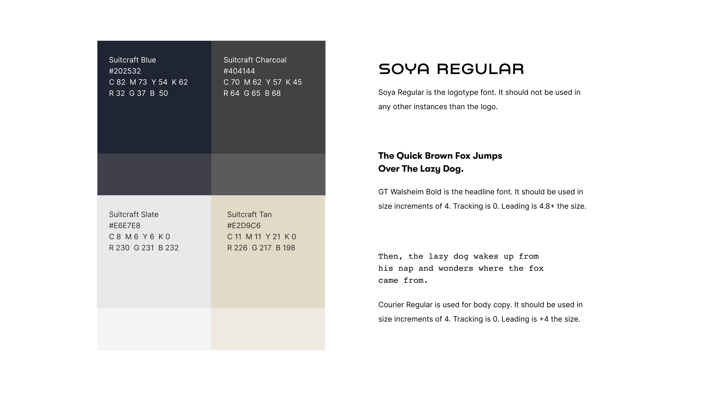
Creating a design language of color and typography is what ultimately creates cohesion across the brand’s touchpoints.
For color, we gave Suitcraft a classic, bold palette, and a system of typography that achieves the same look and feel. GT Walsheim as a sans serif for bold, clean headlines and to add a technical flair to the body copy, Courier.
Iconography
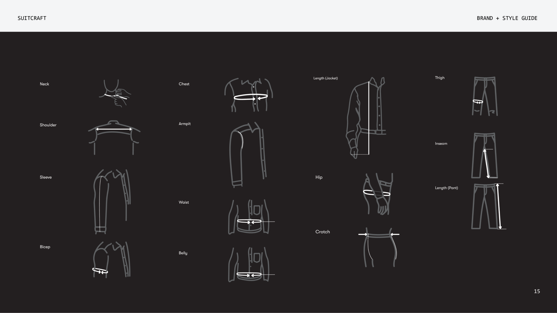
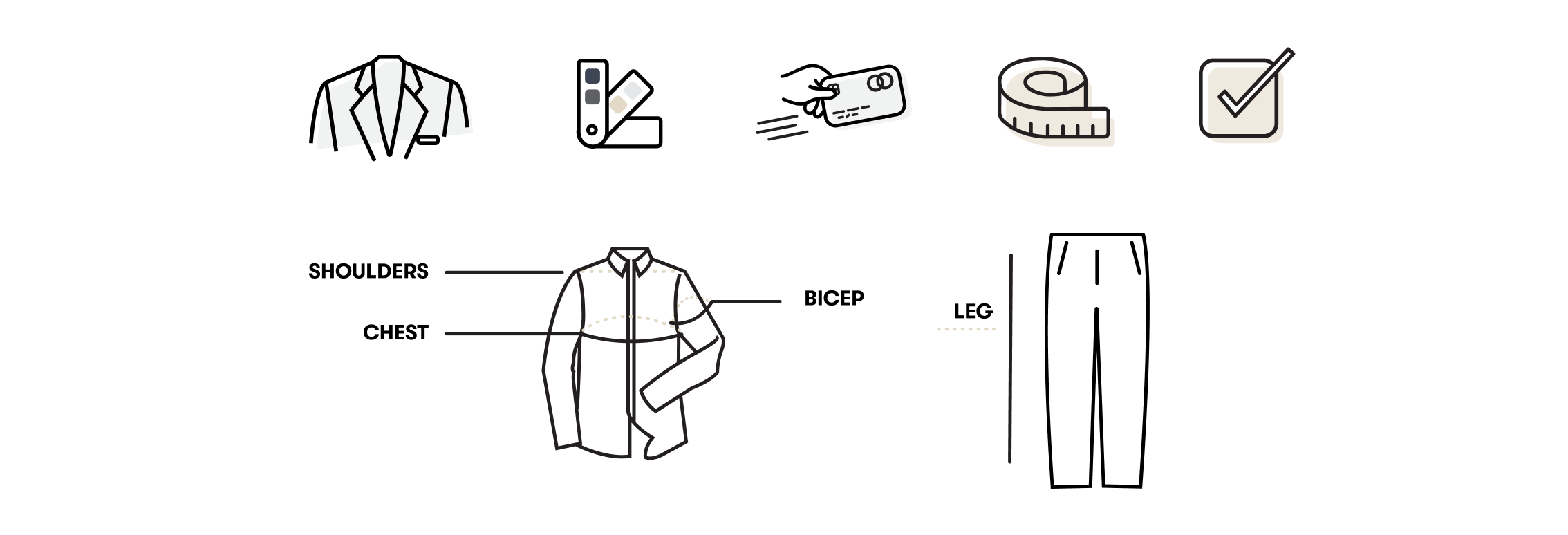
Custom iconography sets were key in the brand language as these visual elements help to educate and guide the customer through a dynamic digital experience.
Process and measurement icons were designed for the website to live alongside the brand explainer, and to assist with customer’s taking and entering measurement specifications.
Print Collateral
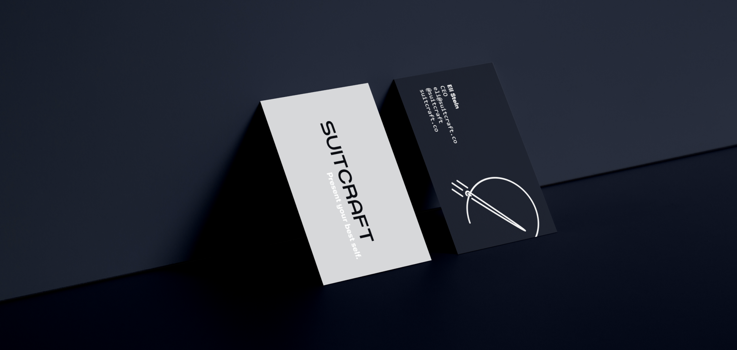
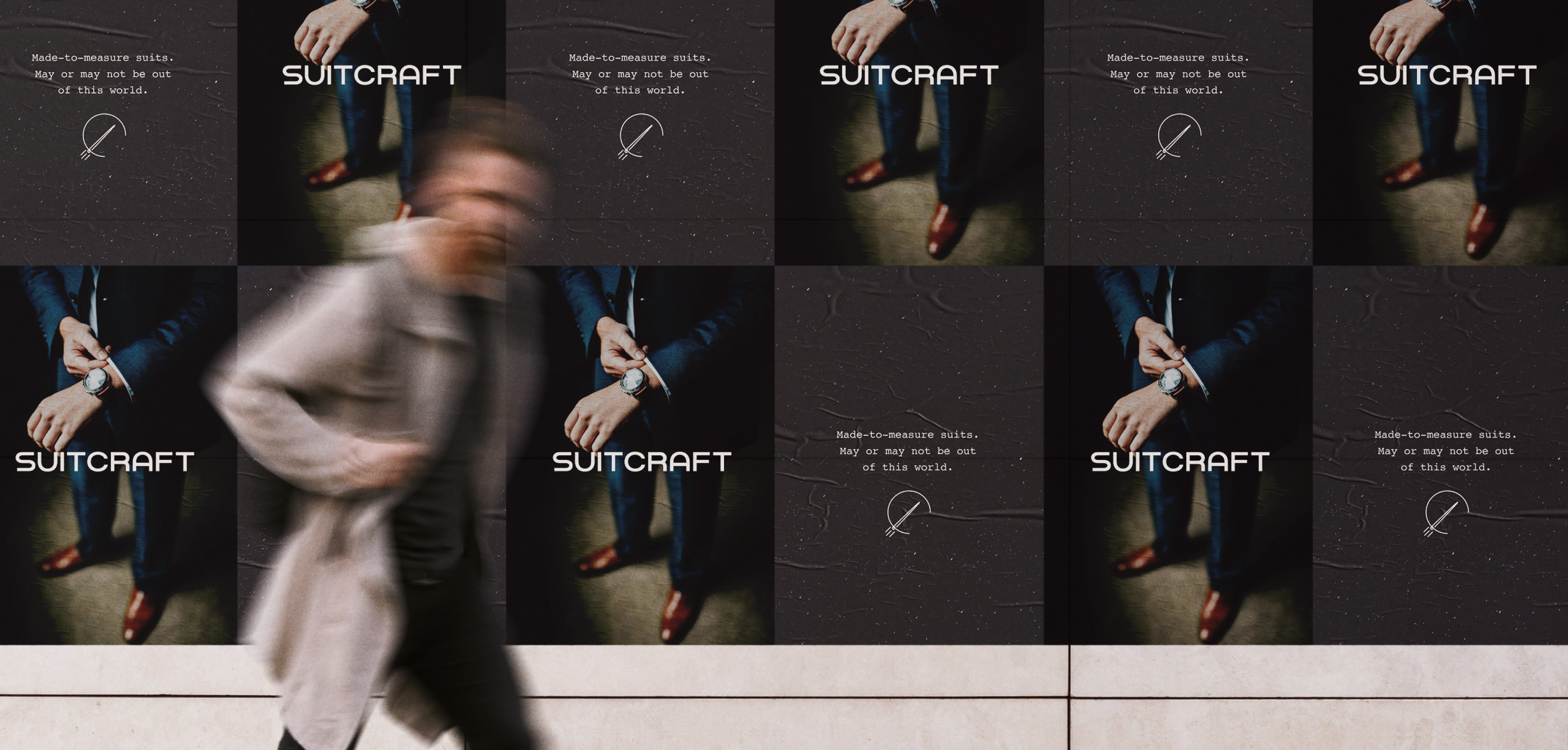
In terms of application, we pulled out the stops to get Suitcraft in a position for its early stage hustle. This included: a primary garment tag, business cards for the two founders (including a—I’m biased—gorgeous matte finish with a glossed and embossed tagline), some starter corporate letterhead templates for all things admin, and a mocked wild posting for ideating future street-marketing campaigns.
Brand Guidelines
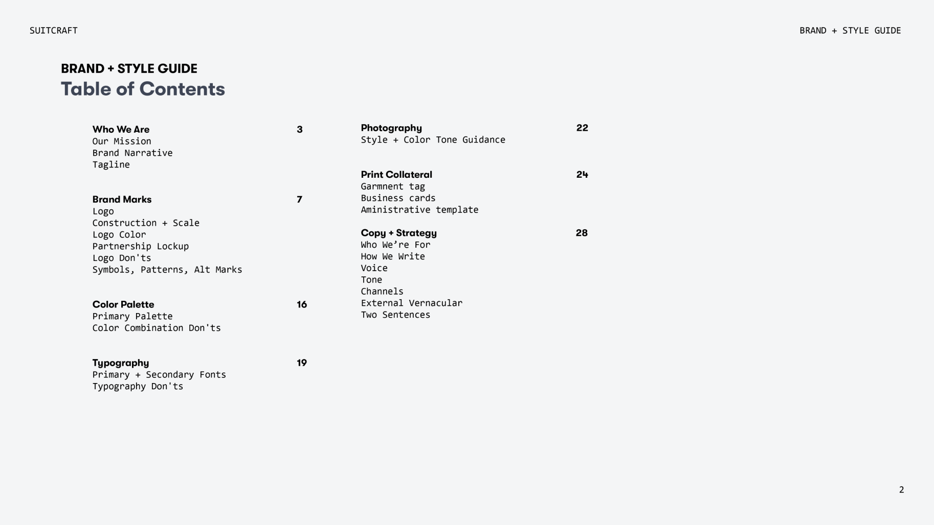
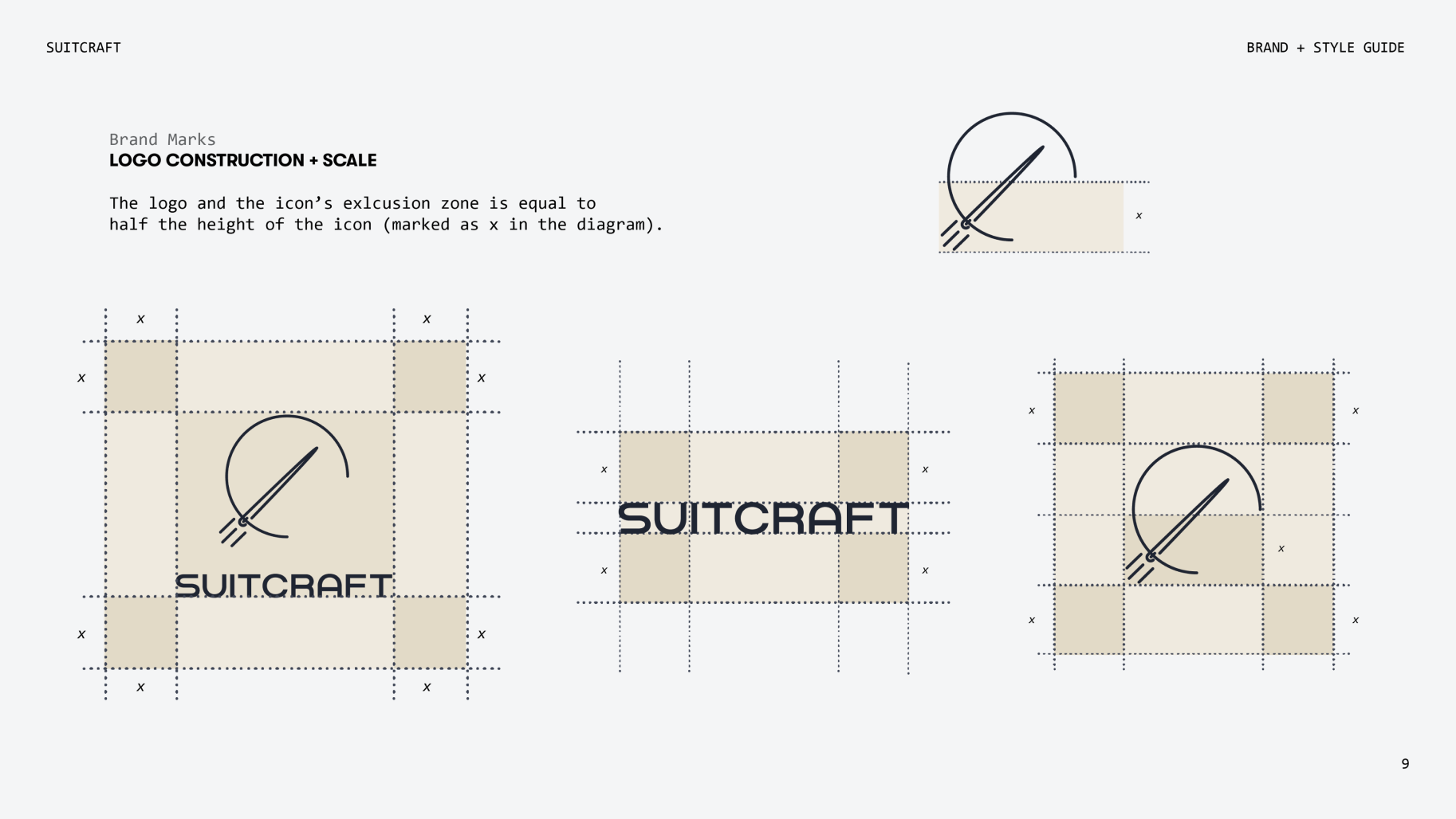
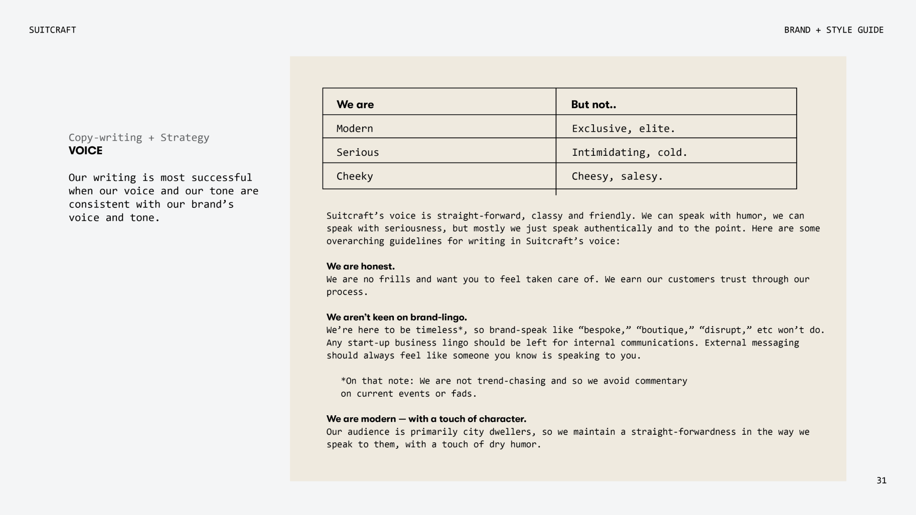
At the end of our collaboration, I created a Brand + Style Guide for the Suitcraft team, providing a summarized, source of visual truth to refer back to as the brand continues to live and breathe.
A peek at that is shown below.
