Brand identity explore.
Nanopath
In 2021, the talented folks over at Tributary Design Studio reached out to bring me on as a Contract Brand Designer to iterate on a second visual identity to pitch to their client, Nanopath — a women’s health tech company. With years having worked at the crossroads of design and sexual/repro health, I was stoked to provide an audible “Abso-freakin-lutely.”
While the client landed on selecting the first direction, I was still happy to have collaborated with the Tributary and Nanopath teams at the crossroads of health literacy and design.
All work seen here should be considered conceptual and proprietary of Tributary Design Studio.


BRAND EXPLORATION
Once briefed in with the output of the full strategic discovery phase, I developed and iterated on the second direction — from mood board through application mock-ups.
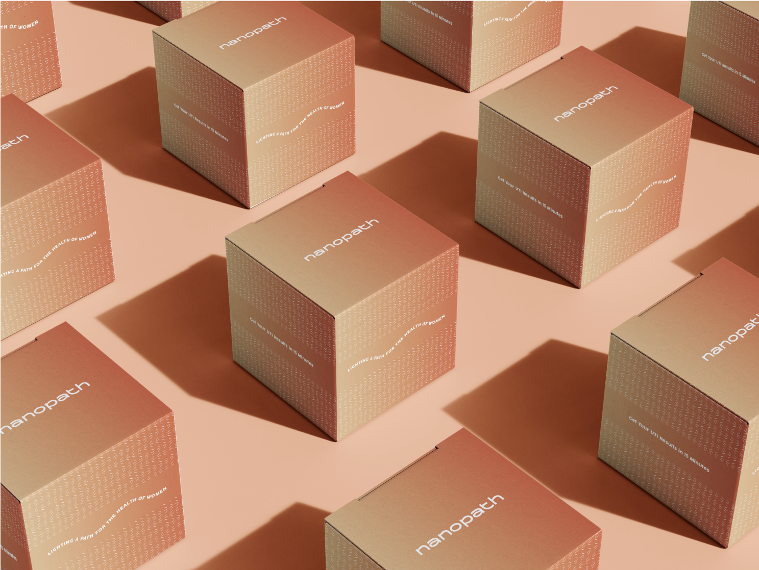
The concept leaned into a nod to Nanopath’s original brand (their rose gold product roots), with a palette and design language that balanced clarity and warmth. Nanopath uses self-service diagnostic technology, and I sought to embody the ease of the patient experience through color and photography style.
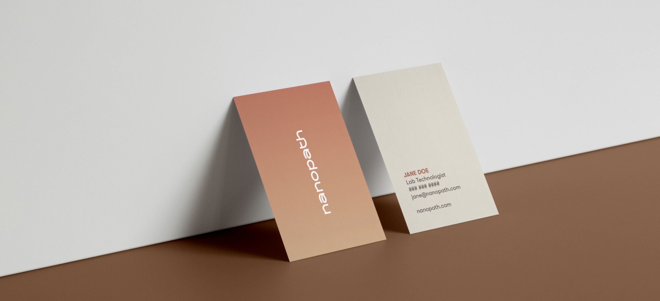
When diving into logo system and typography, I wanted to speak to the more youthful energy of the brand as their primary audience is a younger consumer base. I did this through a range of rounded, stylized marks including a wordmark with some typeface customization.
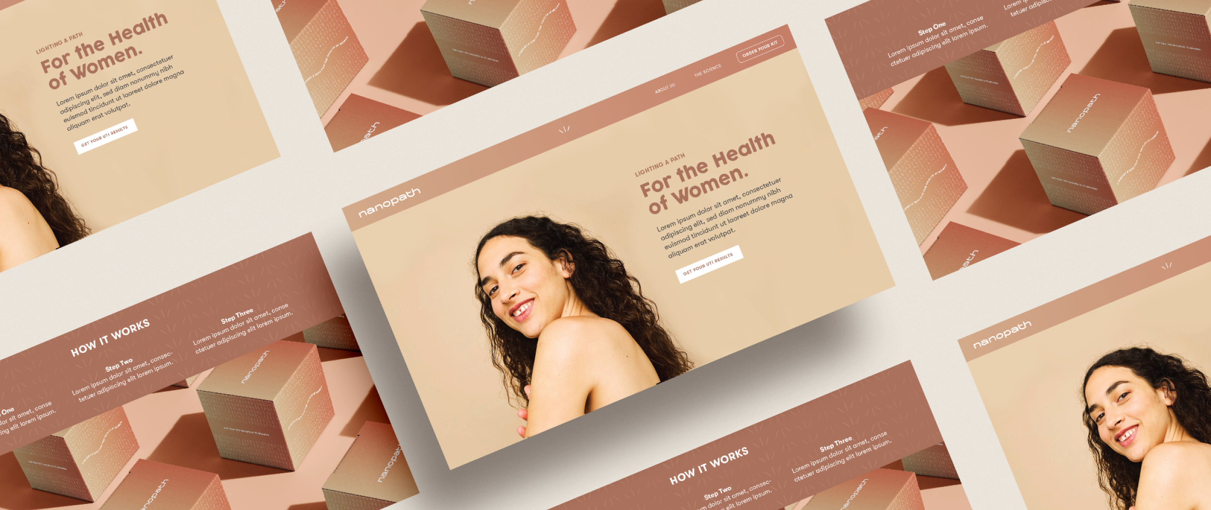
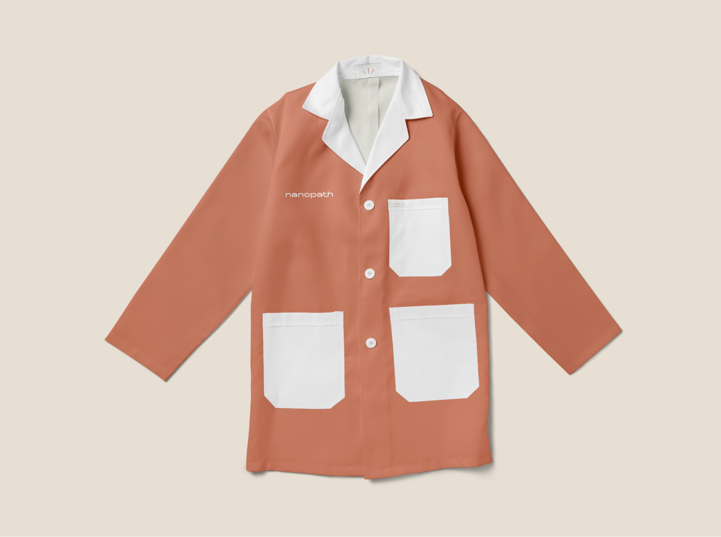
Application on this was the most fun — concepting the brand for their at-home kits, lab coats for the lab and research team, wild postings, and a sampling of the brand’s new website homepage.


